
Netflix is quietly testing a redesigned version of its desktop website, signaling a broader shift toward a unified interface across all devices. The update, currently limited to select users, introduces visual and functional changes that mirror the platform’s Smart TV experience.
The move comes as Netflix continues refining its product ecosystem, aligning web, mobile, and television interfaces into a single, consistent design language.
A Familiar Look Inspired by TV Experience
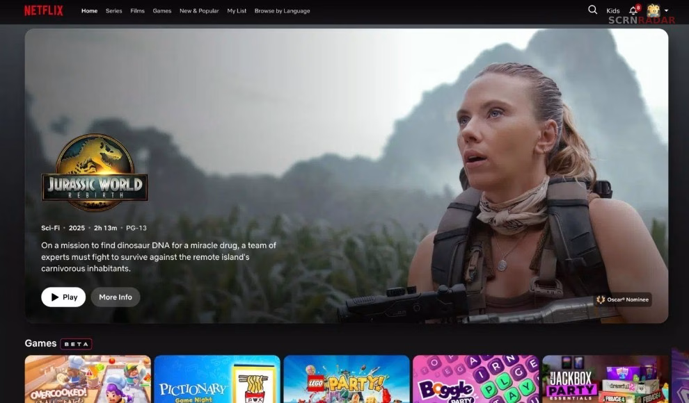
Users who have access to the test version are noticing a redesigned homepage that feels closer to Netflix’s TV interface. Instead of a complete overhaul, the company has opted for subtle but meaningful refinements.
Content rows now resemble the layout seen on Smart TVs, with smoother animations and more dynamic presentation. The interface also features a prominent hero banner highlighting key titles, similar to what users encounter when browsing on a television.
This approach suggests Netflix is prioritizing familiarity and ease of use rather than introducing a radically new design.
One of the most noticeable upgrades is the addition of metadata directly on content thumbnails. As users scroll, they can now see tags like “Recently Added,” “New Season Coming,” or “Highly Rewatched” without needing to click into a title.
These labels provide immediate context, helping users make quicker viewing decisions. The feature has already been widely used on TV and mobile platforms, and its introduction on desktop signals Netflix’s intent to standardize the experience.
The update also includes slightly rounded title cards and responsive background visuals that adapt based on the selected content, further enhancing the browsing experience.
Gradual Rollout Suggests Larger Changes Ahead
The redesign is not yet available across the entire platform. Some sections, including category pages and title detail pages, remain unchanged for now.
This phased rollout aligns with Netflix’s typical strategy of testing features on a smaller scale before expanding them globally. It also indicates that the company may be preparing for a more comprehensive redesign in the future.
Earlier changes, such as the removal of A–Z sorting options and adjustments to labeling like “Netflix Original,” hinted at a broader shift in navigation and presentation. The current update appears to be a continuation of that evolution.
Over the past two years, Netflix has made significant updates to its TV and mobile apps, introducing new layouts, navigation systems, and content discovery tools.
The desktop redesign brings the final major platform in line with these updates. By creating a consistent interface across devices, Netflix aims to reduce friction for users switching between screens.
This unified approach also reflects changing viewing habits, as audiences increasingly move between phones, computers, and televisions while consuming content.